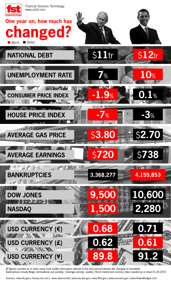
A lot of comparisons have been drawn between the two presidents of the United States of America: George Bush and Barack Obama. People have been contemplating as to what are the significant lessons learnt by Barack Obama from his predecessor. Has there been any change in the economy since Obama assumed the role of the president? This infographic titled “George Bush vs. Barack Obama” sheds light on these questions that’s buzzing in the minds of people worldwide.
This infographic covers the comparison between the differences that were witnessed after completing one year of a presidential term by both the presidents. The national debt during Bush’s tenure was $11tr, whereas it increased to $12tr during Obama’s tenure. The unemployment rate also increased from 7% to 10% during Obama’s rule. The consumer price index, however, increased during Obama’s rule from -1.9% to 0.1%.
The house price index too witnessed a significant increase from -7% to -3%. The average gas price lowered from $3.80 to $2.70. The average earnings too increased from $720 to $738 during Obama’s one year of presidential rule. However, the worst figure highlighted by this infographic is the increase in the number of bankruptcies during Obama’s rule from 3,368,277 to 4,155,853. This infographic is quite informative and covers interesting facts about the differences witnessed during the rule of the two presidents of the United States of America.
Likes: Clever infographic, that can interest anybody.
Dislikes: More points could’ve been considered, graphical tools could’ve been used.
Courtesy:usfst.com

