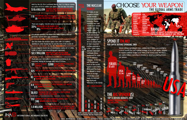
Do you want to know which countries rank higher in the arms trade and which ones are not? This infographic will give you an idea about which countries are investing their maximum amounts in trading arms.
The infographic “Choose your weapon the global arm trade” states the facts, and it could also be the source of major satires about countries lavishly spending in arms trading across the world. The amounts, which are in the billions, would make you think if a World War III is in the cards?
Inevitably, these countries are arming themselves up. There is no immediate threat, yet they are arming themselves up. One likes to think the cause of all this. If you want to check out the horrifying statistics, check out this picture below. It will also tell you how much each of these arms cost. The prices of some of these are in trillions of dollars. Wonder who would spend that kind of money in arms trades whilst millions of children lie hungry across the streets.
But this infographic is certainly an eye opener. Check it out even if you are remotely fascinated with arms and ammunitions. You wouldn’t believe what kinds of ammunitions are available in the markets these days. Also makes you frightened as to where we are heading.
Likes: This information on choosing the right weapon is very elaborate. The overall presentation, including the background is very well chosen.
Dislikes: The only complaint is that, the letters are vaguely readable. They could have been bigger or clearer. But in this version they are hardly readable at all.
Courtesy:princeton.edu

