Everyone likes to live in a safe environment at home. One needs a sense of security and stability to conduct his or her daily routine with peace of mind. The last thing we need in our busy schedules is for our house to get burgled. All that effort in maintaining our homes and securing our assets could go down the drain in one, untimely moment.
It is in this context that simplisafe.com has put forth a lovely tool on its site to help raise awareness among people about burglaries in the US. I refer to it as a tool, and not so much an infographic, because this is the first time I can actually participate with the graphic. It makes one realize that in today’s information rich world, people online need interactive content more than ever before to capture their ever dwindling attention spans.
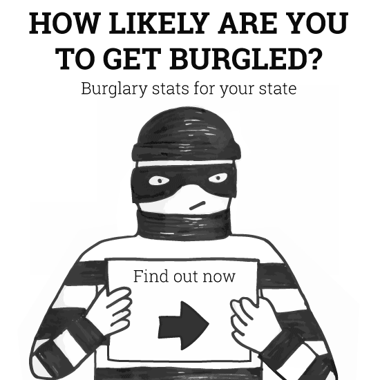
The initial graphic on screen represents a wanted burglar holding up a placard akin to him in a jail cell. The placard is a dropdown that allows you to pick a state in the US, for example, California. Once done, it then compares how likely you are to get burgled in California versus the national average statistics and trends.
I also like the colors used in this infographic – black and white. It’s almost as if the reader is viewing something in a classroom on a chalkboard. Even the burglar image looks like a nifty but simple work using sketch pens. The entire infographic follows a block pattern, alternating with white font on black background and black font on white background.
Coming back to the dropdown, once a state is selected, it tells the user (in percentage terms) how much more (or less) likely he is to be burgled compared to the national average. This is also validated in actual numbers. For instance, the burglary rate in Arkansas is 1081 per 100,000 households versus the national figures i.e. 667 per 100,000 households.
Hence, people living in Arkansas are 62.1% more likely to be burgled. The next part of the infographic shows the increased rate of burglaries in the selected state (in this case, Arkansas) since 2000 (in percentage) and is compared to the national average change again. What is good here for the user is a line diagram that shows the changing trend of the state Arkansas since 2000. This makes reading and grasping the information very easy and convenient.
The final part of the infographic tells us how many dollars’ worth of stuff has been stolen from American homes in the past 24 hours, and majorly what those items are. Overall, this infographic has made me rethink the way infographics should be created. I think the next wave of such graphics will end up being called interactive infographics.
Simplisafe.com has put out a neat, simple yet effective bundle of information. If I wanted to keep my home in the US safe, I would definitely check this one out.
Home-Security.com recently published a comprehensive guide about Home Security in Colorado Springs.


