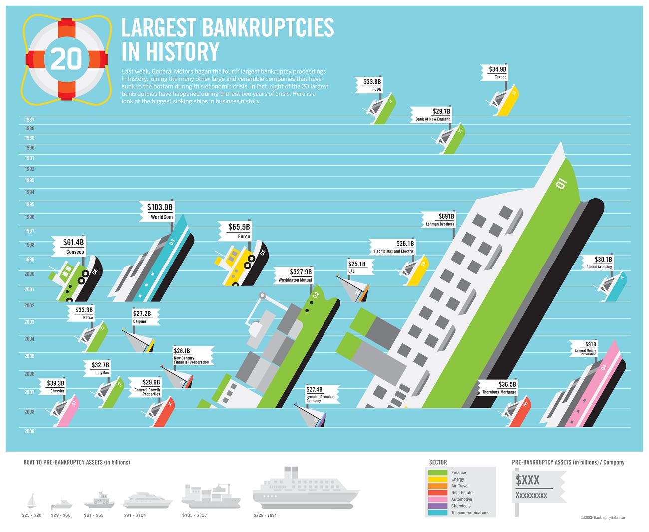
So many people had gone bankrupt during the recession, but there were even harsher bankruptcies – harsher in the sense that they were even bigger in figures. Did you know which the largest bankruptcy in history is? This infographic is here to tell you all about it. Some of the names included in here were of the giants in the market, the ones whom no one saw coming.
In this infographic the “largest bankruptcies” there is a whole list names included. One can also see how these bankrupt companies have been depicted. A sinking ship has been assigned by the names of each of these companies. The sinking ship defines the downfall of the empire. This is all a very well thought out infographic which not only manages to capture the name of the companies but has also shown us what it implied. In which year their downfall occurred has also been shown in this infographic.
The best part is that, the higher the bankruptcy level, the bigger is the boat. So if one tries to find out which company had the worst fall of them, one can easily locate the biggest sunken ship from this infographic. In this infographic though, it has been shown that the Lehman brothers have had the highest fall of about 691 billion USD.
Likes: All the bankruptcies have been well shown. It is a neat, well designed graph.
Dislikes: The information about the “how much” is slightly difficult to locate. Otherwise, the data are overall well arranged.

courtesy:awesome.good.is

