It was the best of times. It was the worst of times. The Internet and virtually every feature associated with it were started in the United States (and maybe that is why the NSA is so gluttonous for information). It began 50 years ago with the Arpanet, evolved into the Internet as we know it today, and for a long time, Americans could access the Internet far faster than anyone else could.
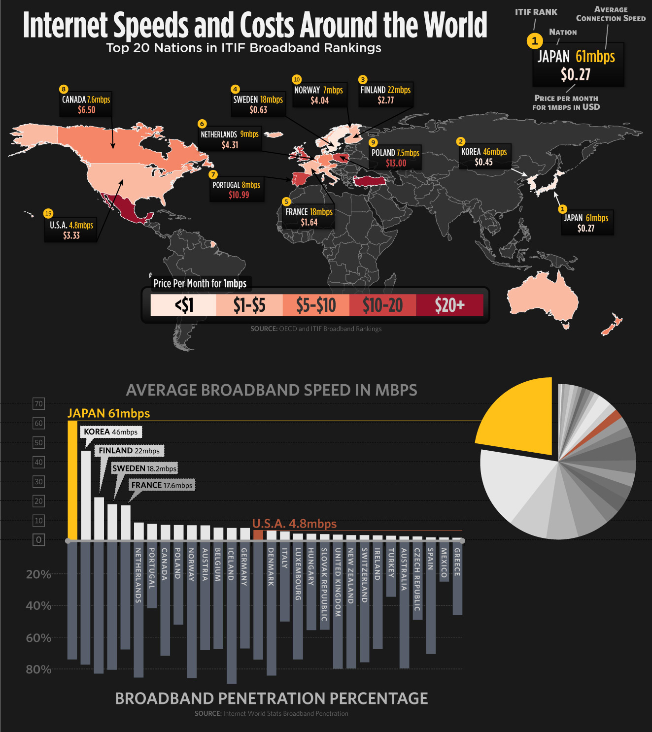
Alas, the “Worldwide Broadband Penetration” infographic shows that hard times have come to those in the United States. The costs may be slightly better than average (although still a far cry from the low prices enjoyed by others throughout the world). However, the speeds are abysmally slow. We wonder if it is better to send a message by carrier pigeon than by a message or email through the Internet in the United States. The speeds in the U.S. are slower than those in Iceland, and that country went through a devastating financial crisis.
The broadband penetration percentage in the United States also lags behind those of many other countries. Maybe all of this is not its true representation, however. The infographic is almost exclusively of countries in Europe and North America. South America, Africa, the Middle East, South Asia, South East Asia, and Eastern Europe are not represented.
Likes: We have already read and seen a lot of information which confirms the accuracy of the information on the United States in this infographic.
Dislikes: Almost all of the developing countries, and the world are overlooked.
Click to enlarge

Courtesy: standoutessay.com
