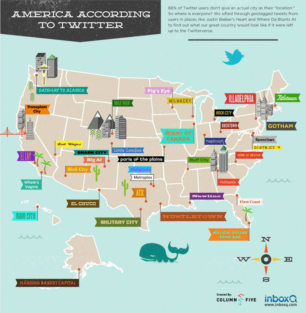
How well do you know your Twitter follower? Especially, those who live in the United States? Did you know that a major chunk of the residents of United States provide something philosophical in their “location” column, instead of their actual location? So where on the world do these people live?
This infographic titled “Infographic America According to Twitter” addresses similar questions as this. You can say that it is an attempt to get into the facts about the US based Twitter users, to know them better. Some of the US residents give hilarious answers like “I live in Justin Bieber’s Heart” – of course that comes from a Justin Bieber fan.
And then since there are so many celebrities on Twitter, the followers often form a fan club of their favorites and they transform all their information into the terminologies of their revered star. This is what goes on, on Twitter. So how would you exactly know where the person you are interacting with comes from? This is what we are here to find out about.
This infographic is basically aimed to make fun of all these verses of Twitter and it shows you how United States would look like if it were left to the users of Twitter geotags.
Likes: It is a pretty infographic which is a fresh break from the heavily informative infographics. It adds a touch of light humor and is fun to read.
Dislikes: Nothing to be disliked in this picture. Overall it is a good infographic.
courtesy: inboxq.com

