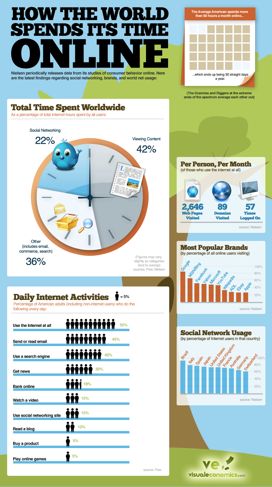
Have you ever noticed how time seems to slip by when you are in front of your computer? Youngsters today spend lots of time hovering over Facebook, Twitter and other such social media platforms. But why blame only them, when even adults can’t seem to resist the addiction of just scrolling down on Facebook news feed? This infographic tells you “How the world spends time online”.
It is about showing you that what percentage of the time is spent on various social media and which of them is the highest. But it also shows you what people do mostly on each of these forums. Like, do they spend time only hovering over someone’s chat box? Or do they watch contents from various persons on their friend list? Or what do they do exactly on these social media platforms. This is what this infographic is here to tell you.
Now we know that different kinds of social media platforms have different style of content. For example, you can view statuses, play games, share on someone’s wall, etc. on Facebook. Likewise Twitter allows you to write only within 160 characters and within that you have to express your statuses. So the way people spend time on these two networks is also different.
Likes: The infographic is pretty clear on what it tries to convey. The statistics are all arranged in separate graphs.
Dislikes: It may seem a little too generic.

Courtesy: visualeconomics.com
