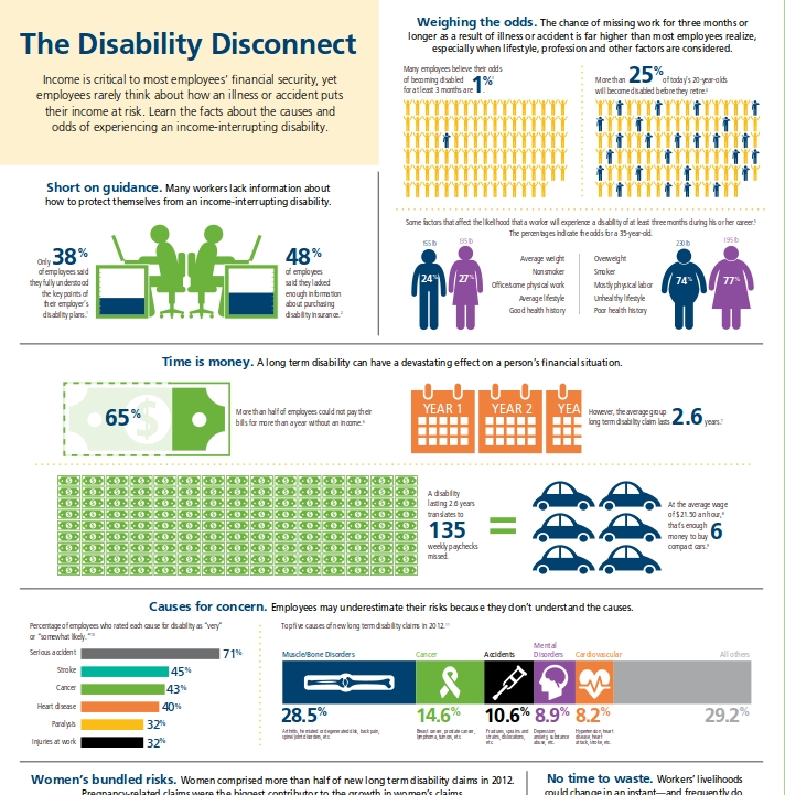
The Council for Disability Awareness (CDA) is a nonprofit organization dedicated to the cause of educating the American public about the risk and consequences of experiencing an income-interrupting illness or injury. The CDA engages in research, communications and educational activities that provide information and helpful resources to wage earners, employers, financial advisors, consultants and others who are concerned about the personal and financial impact a disability can have on wage earners and their families. This particular infographic, titled Disability Disconnect, aims to educate people on the impact illness or injury can have on their financial security.
The tone of the infographic can be instantly identified as cautionary. The information is divided into 6 different blocks. More weight is assigned to certain blocks over the other. This could be due to the importance the authors assign to various implications of injury or illness to financial security. For instance, lets try and analyze this weightage by way of a pie chart:
Time is money is the most crucial information any employee should look at. A long-term injury can have the most detrimental effect on finances. A fact: 65% of employees who were out of work for a year could not pay their bills for more than a year. The average group disability claim lasts 2.6 years, which equates to 135 weekly paychecks missed. At the average wage rate of $21.50 per hour, that’s enough to buy 6 compact cars. The author has created a beautifully structured flow of information, knitting together facts in sequence. It is hard-hitting and impactful, with the use of different font sizes and colours (dark blue) to press home the important information.
Another interesting block of information is the cause for concern. Again, the use of colors impacts the reader. The block is divided into two sub parts – one talks about the percentage of employees who rated various causes for disability as “likely” or “somewhat likely”. There are causes like serious accidents (highest likelihood rating) and injuries at work (lowest likelihood rating) amidst others such as heart disease, paralysis, cancer and strokes. The other part graphically indicates the top 5 causes of new long-term disability in 2012. It uses primary contrasting colors well such as green, orange, purple, black, blue and grey. The information display is clean and easy to understand.
One must not try and expect this infographic to be a soothsayer on disabilities. The information under sections like short on guidance and weighing the odds is purely to raise awareness. Unlike the rest of the infographic, these two sections are a bit too heavy on the eye. There is too much text, and some visual relief could have been provided. Sections like short on guidance and no time to waste are quite redundant.
All in all, it is a very good guide for raising awareness related to the impact injuries and illness can have on the employees financial situation. One only has to look at a sportsman’s life and realize how lucky some of us are to actually have lengthier careers.
Click to Enlarge


