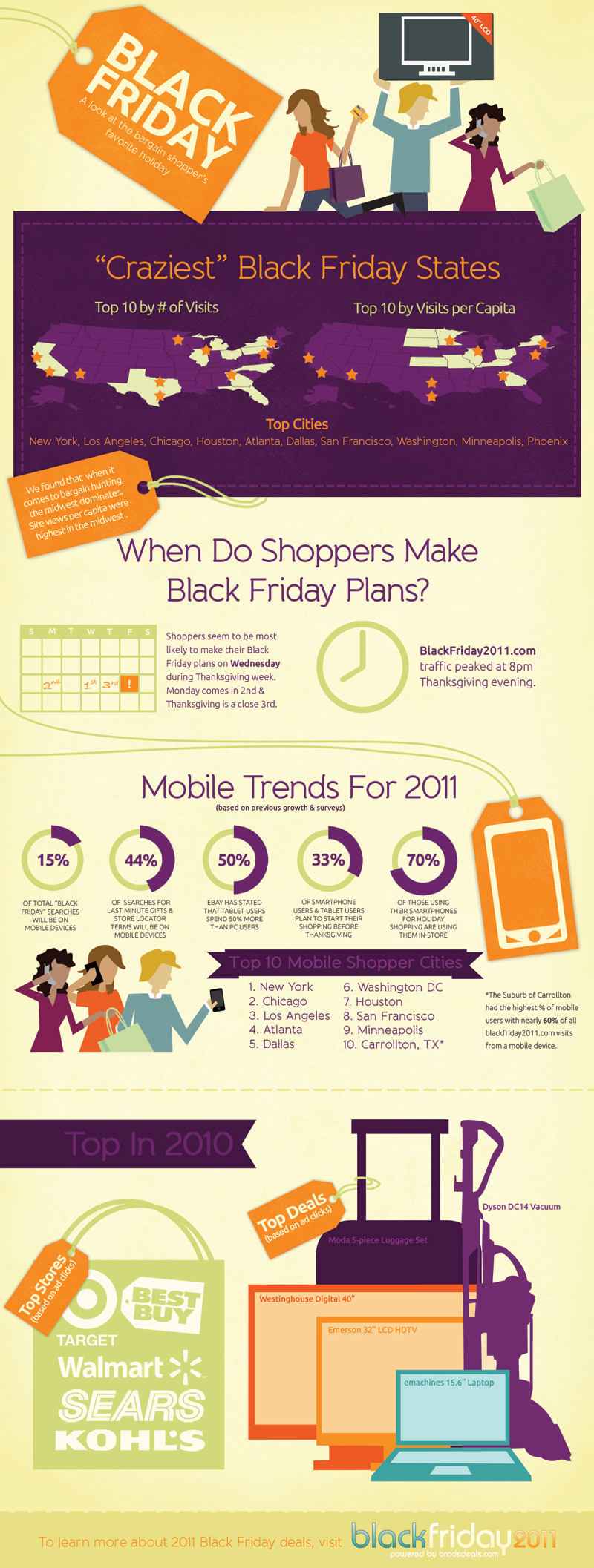
The “Crazy for Black Friday Deals” infographic seems to contradict itself and yet, at the same time, seems to elucidate something that we wrote about earlier. In a related infographic about Cyber Monday, we wondered why the sales figures for Cyber Monday were paltry in comparison to Black Friday, even though there is a growing realization that people buy more things online than they do in the brick-and-mortar world (and we believe that this has been the case for the past 10 years).
The information is this infographic about Black Friday seems to indicate that much of the sales are, in fact, done online rather than to the historically accurate situation of shopping at retail stores. It may be immaterial though. Regardless of whether the sales are done online or inside physical stores, the sales figures for this one day are a behemoth.
This day seems to be especially prevalent in the central areas of the country, primarily in the North (North and South Dakota and Minnesota) and in the central area (the line of states from Nebraska to Ohio), although New York and Georgia also figure prominently.
Yet, the infographic does seem to contradict itself or, at least, provide incomplete information. It states that the most popular stores (based on online ad clicks) for this date are Best Buy, Target, Walmart, Sears and Kohl’s. Although we do not have corroborating evidence, we assume that Amazon would be the very largest. We do not know why it was excluded or overlooked.
Likes: The “Mobile Trends” section presented some new and unique facts.
Dislikes: The “Top Cities” and the “Top Mobile Cities” ought to have been placed next to each other to compare and contrast them better.
In honor of our upcoming shopping holiday, Crazy for Black Friday Deals from BradsDeals takes a look at some of the stats behind Black Friday (day after Thanksgiving) shoppers.
BradsDeals created a Crazy for Black Friday Deals infographic to illustrate historical Black Friday figures as well as the shopping trends and predictions for this year’s holiday.
If you live in Minnesota, congratulations, you live in the most Black Friday crazy state in the country. And while Black Friday fans in major cities like New York, Los Angeles and Chicago may be more likely to cruise Black Friday deals on their smart phones than shoppers in smaller towns, the Dallas suburb of Carrollton blows everyone out of the water with 60% of Black Friday searches happening on mobile devices. WOW.
I live near Carrollton, but I wouldn’t consider it a particularly tech-savvy area. Apparently, they’re good with mobile shopping…who knew?
Of course, I get tons of Black Friday infographics submitted to the site, but I really liked the design of this one. The information is visualized in a clear, easy-to-understand design. The visuals are simple and relate to the data. Maps for cities, calendar for days shppers make plans, doughnut diagrams for percentages and silhouettes of top products.
On the other hand, there doesn’t seem to be a cohesive story to this infographic. It’s a collection of disconnected data points about top cities, mobile trends, top products and when shoppers make plans. Also, the design is missing a list of the data sources, the URL for readers to find the original posting, a copyright or creative commons claim and recognition of the designer. Why should we trust any of these statistics?
Infographic via: CoolInfographics.com

