Everything we see around us possesses a distinct identity. The matter of fact that we are able to see them is because they have same particular color. Colors play a vital role in our life, as everything that we visualize possesses some or other color. It’s the first thing we notice while we see a particular object.
As it is rightly said that “First Impression Is Last Impression”, we need to be very careful in choosing colors in our life, which represents us, our personality etc. The color of our wardrobe, our house walls, our car determines us, what kind of person we are, what would be our liking/disliking etc. There’s a phrase in hindi which says “Har Rang Kuch Kehta Hai” which means Every Color signifies something.
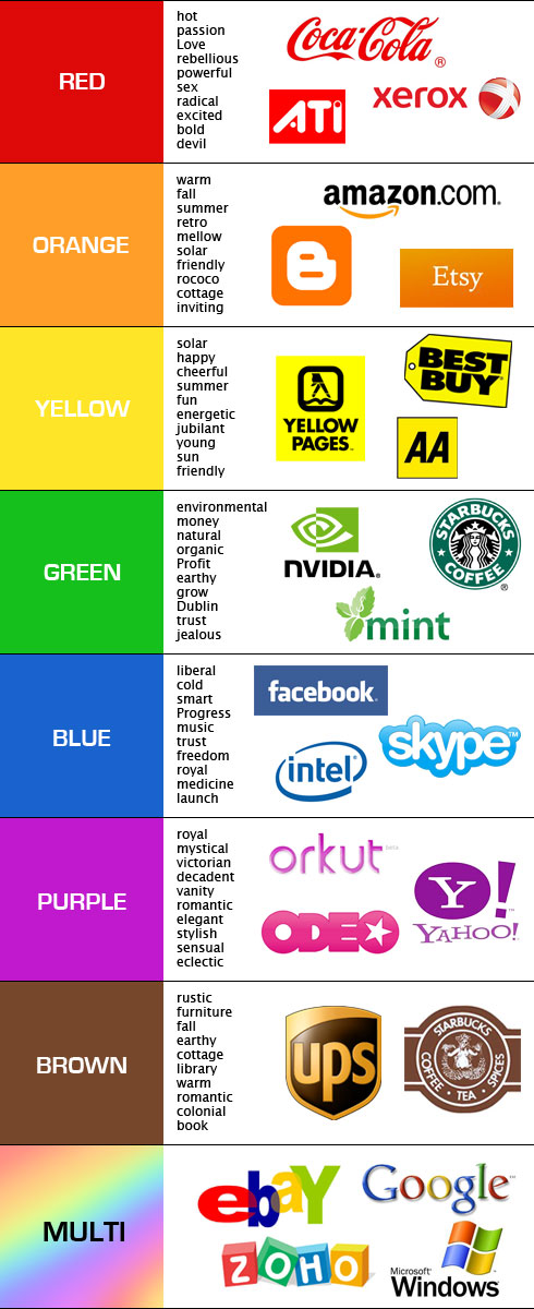
The below infographic is all about the colors and what colors we should choose for our brand to make it look more appealing, more attractive. There’s no second thought when we say many colors resembles something or other. Like ,red stands for love, white stands for peace. On contrary red also stands for danger and white does resemble as being colorless.
So it’s all about our perception and the way we look at things. But all said, we surely need to be very careful while choosing colors for our brand. Let’s have a look at the following infographic as to which brand choose its identity by selecting a particular color.
Courtesy: usabilitypost.com

