According to the latest payroll data from the US Bureau of Labour Statistics, the unemployment rate declined from 7.3 percent to 7.0 percent in November, and total nonfarm payroll employment rose by 203,000. Employment increased in transportation and warehousing, health care, and manufacturing. Among the major worker groups, the unemployment rates for adult men, women, teenagers and other significant groups like Hispanics, Asians and African-Americans were little changed from a year earlier.
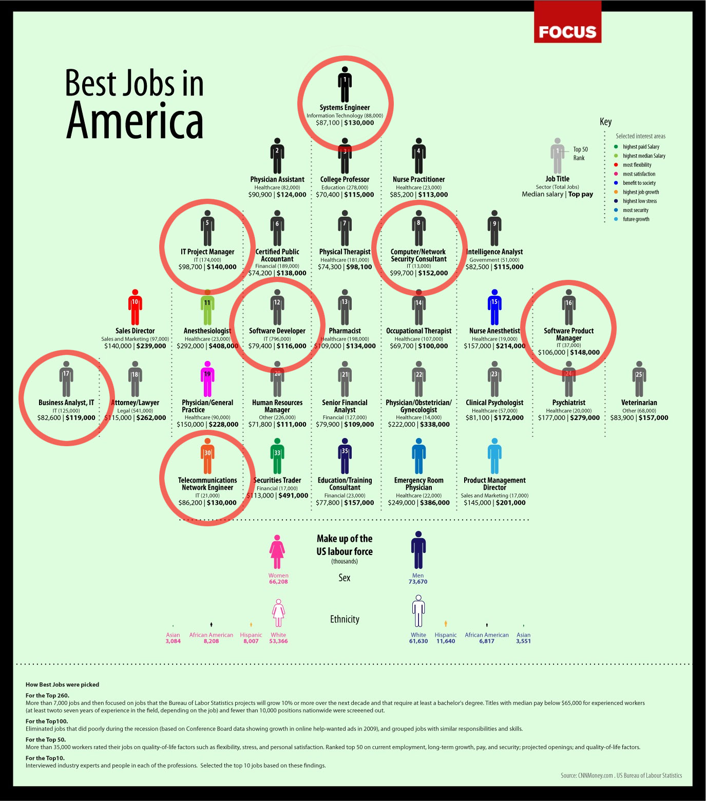
Rating the top jobs in an economy and work environment as hectic as the current US situation is a tough job with several parameters; permutations and combinations to watch out for. The infographic from cccblog.org is concise and packs all the information tightly with the visual. With the help of the visual key, the viewer is able to immediately discern and differentiate between what jobs constitute the highest salary, the most and least stress, job growth and so on.
It’s no surprise that the top rated job in an economy driven by technology and consumerism is that of a Systems Engineer. The total number of jobs available in the sector is a promising 88,000 while the salaries in the division range from $87,100 to $130,000.To arrive at the top fifty jobs statistics, 35,000 workers rated their jobs on quality of life factors like flexibility, stress, and personal satisfaction. Coming in after first position, are jobs in the medical and educational space like a physical assistant, college professor and nurse practitioner at positions two, three and four respectively.
While many argue that studies and data like this are skewed and not a robust representative of the actual reality, the information was collected basis a review of several factors such as current employment, long term growth, pay security and projected openings in the sector. Apart from this, to calculate the top ten professions, detailed interview with industry experts were carried out.
What I like about the infographic is that in spite of the fact that it is heavy in terms of numbers, the information is presented in a simple, matter-of-fact manner so as to not overwhelm someone who is looking at it. Also, with the help of colours, it is easy to distinguish professions by most and least flexibility, highest job growth, future growth and more security across the visual.
Fun details emerge via the graphic, such as the fact that Sales Directors have the most flexibility in their jobs, while a Physician or someone running a General Practice, has the most job satisfaction. Apart from the pyramid structure of the visual that helps understand ranking and the hierarchy in the job standing, softer details like the sex and race ratio are covered in the graphic. While the number of working males in the organized sector in the US are at 73,670, the number of women are at 66,208. Both these figures are in thousands.
Details of ethnicity too, emerge such as the facts that the highest number of workers in this total population are white men, while the lowest are Asian women.
Overall the infographic achieves the goal is sets out to do, with clear communication and easy visuals.


